Brand Systems
I build identities that scale. The logo is just the start — the system behind it is what survives rollout.
I design from Johannesburg for the world — brand systems, digital products, and AI-driven campaign visuals. Whether it's a corporate identity or a mobile app, the work either lands or it doesn't.
 VS Code
 Cursor
 Codex
Codex Supabase
Decade-deep in brand communication, campaign production, UI systems, and AI imaging — mostly from inside corporate SA, partly from building my own products. I know what's easy to make and what's hard to get right. That difference is what I'm hired for.
I build identities that scale. The logo is just the start — the system behind it is what survives rollout.
App screens to full product UI. I design things that work, not just things that look good in mockups.
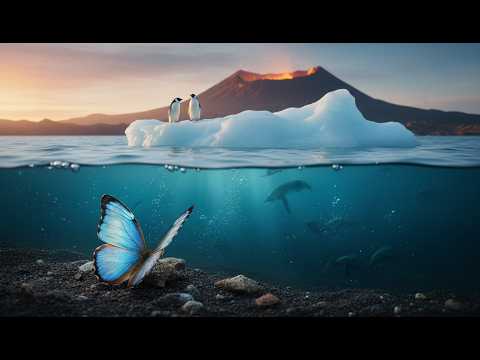
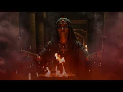
Commercial-grade imagery at startup speed. I've built AI pipelines that produce what used to need a full production team.
Video editing, social content, motion graphics. The edit is where a campaign either comes together or falls apart.
Some of these brands I built from scratch. Others I stepped into and pushed further. All of it is real work made under real constraints.
 Product Brand / Consumer Tech
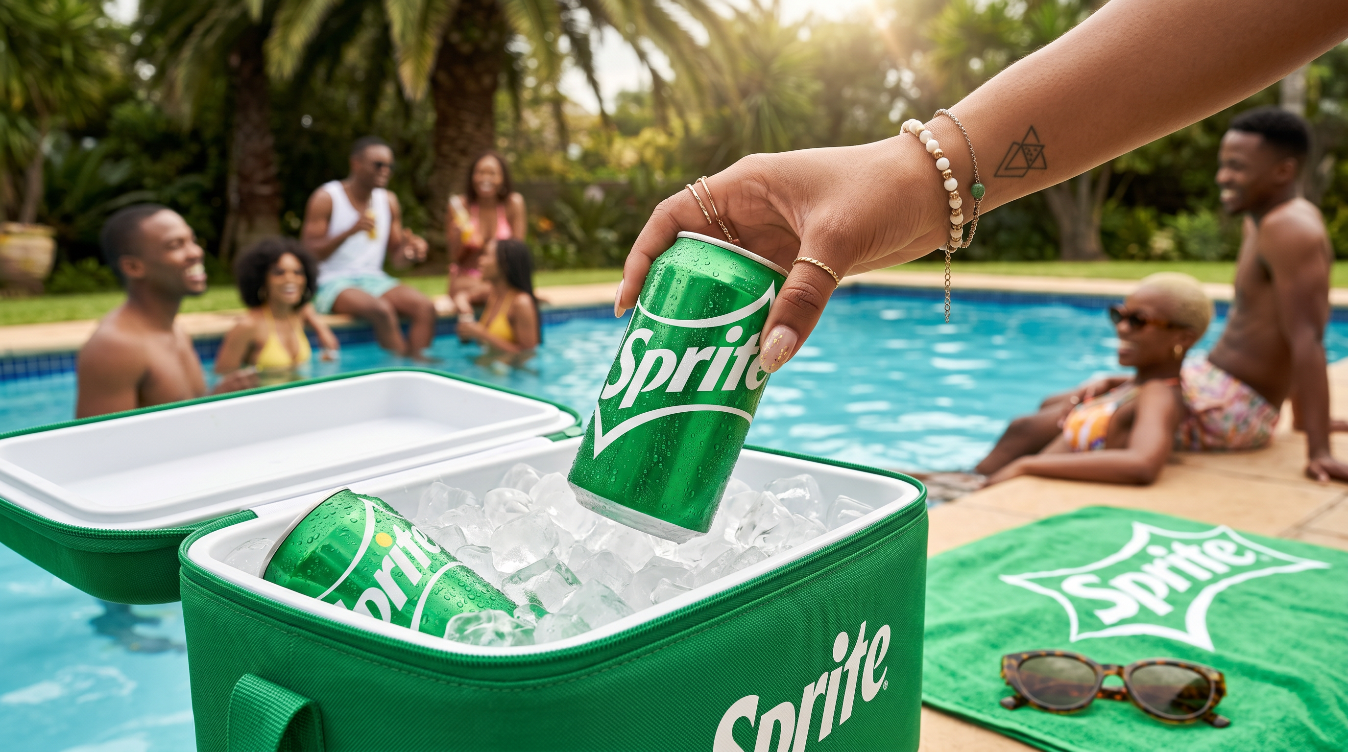 FMCG / Campaign
 Global Sports / Campaign
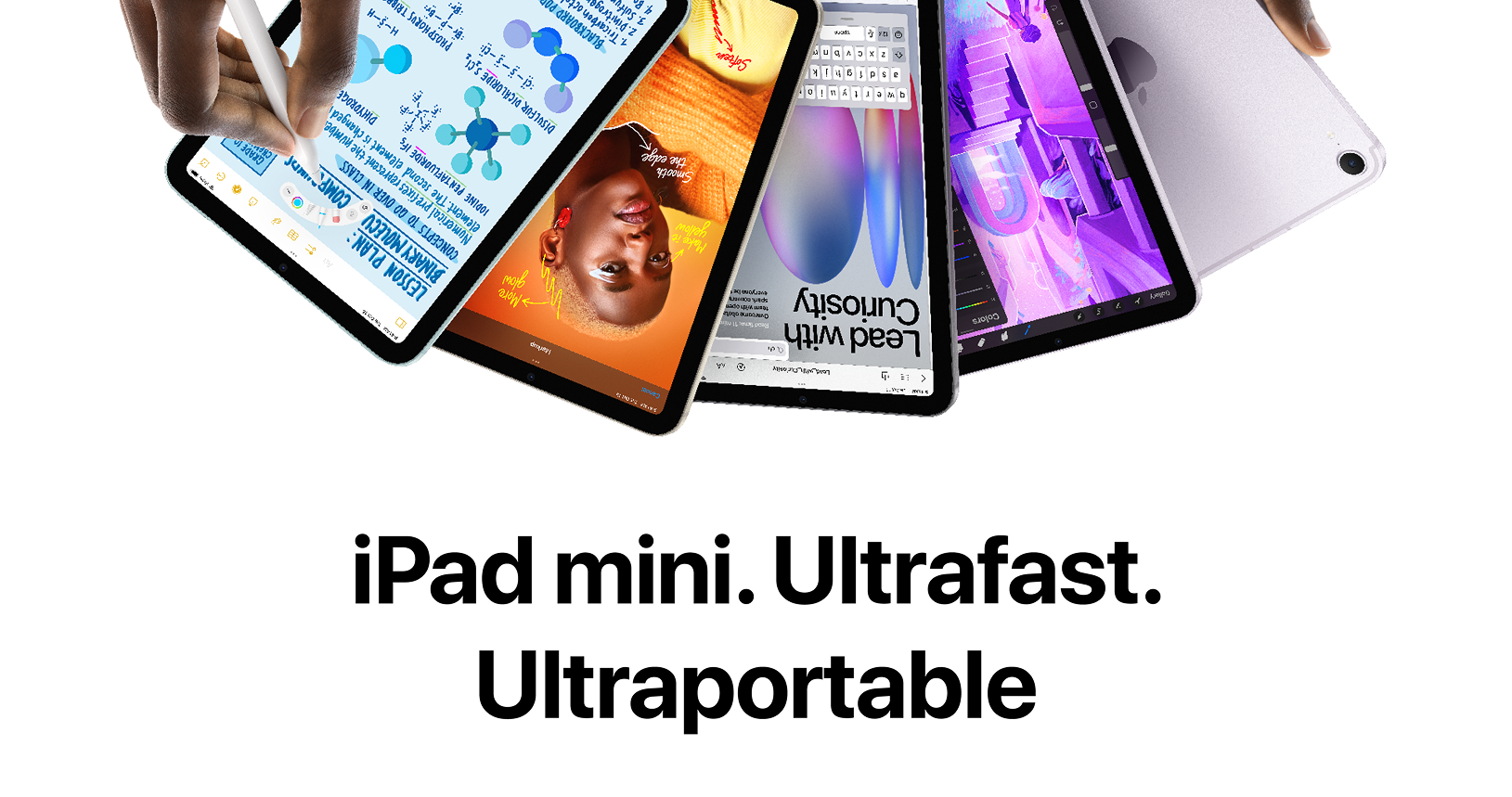 Retail / Product Marketing
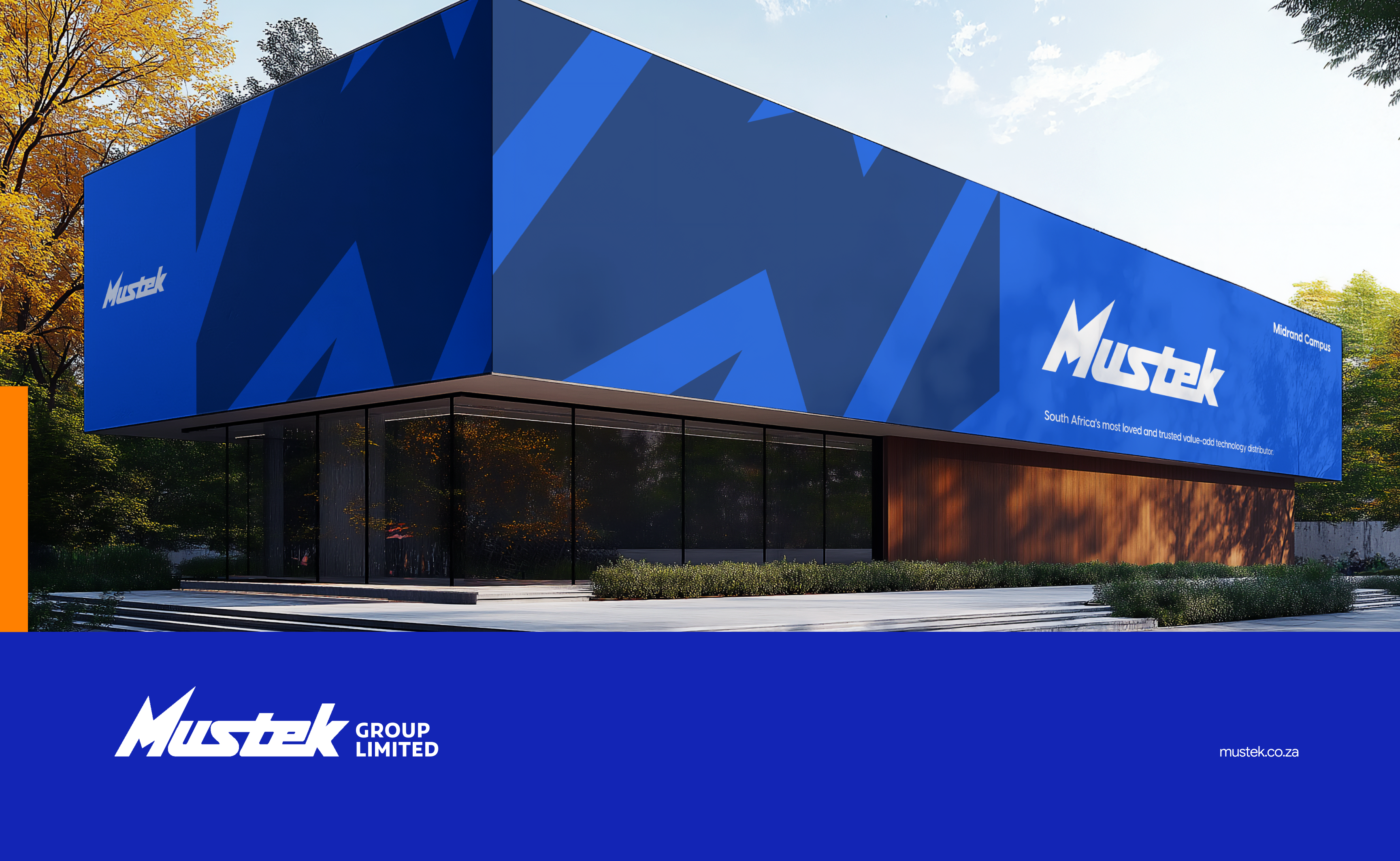 Enterprise / Tech Distribution
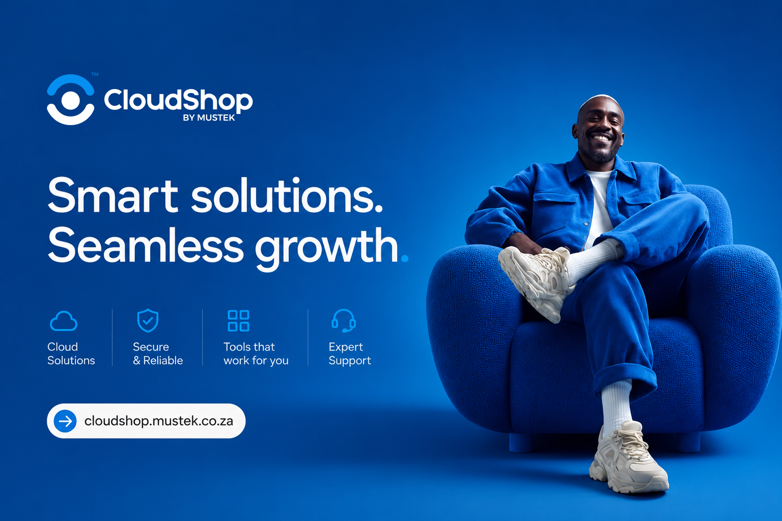 Brand Identity / Digital Platform
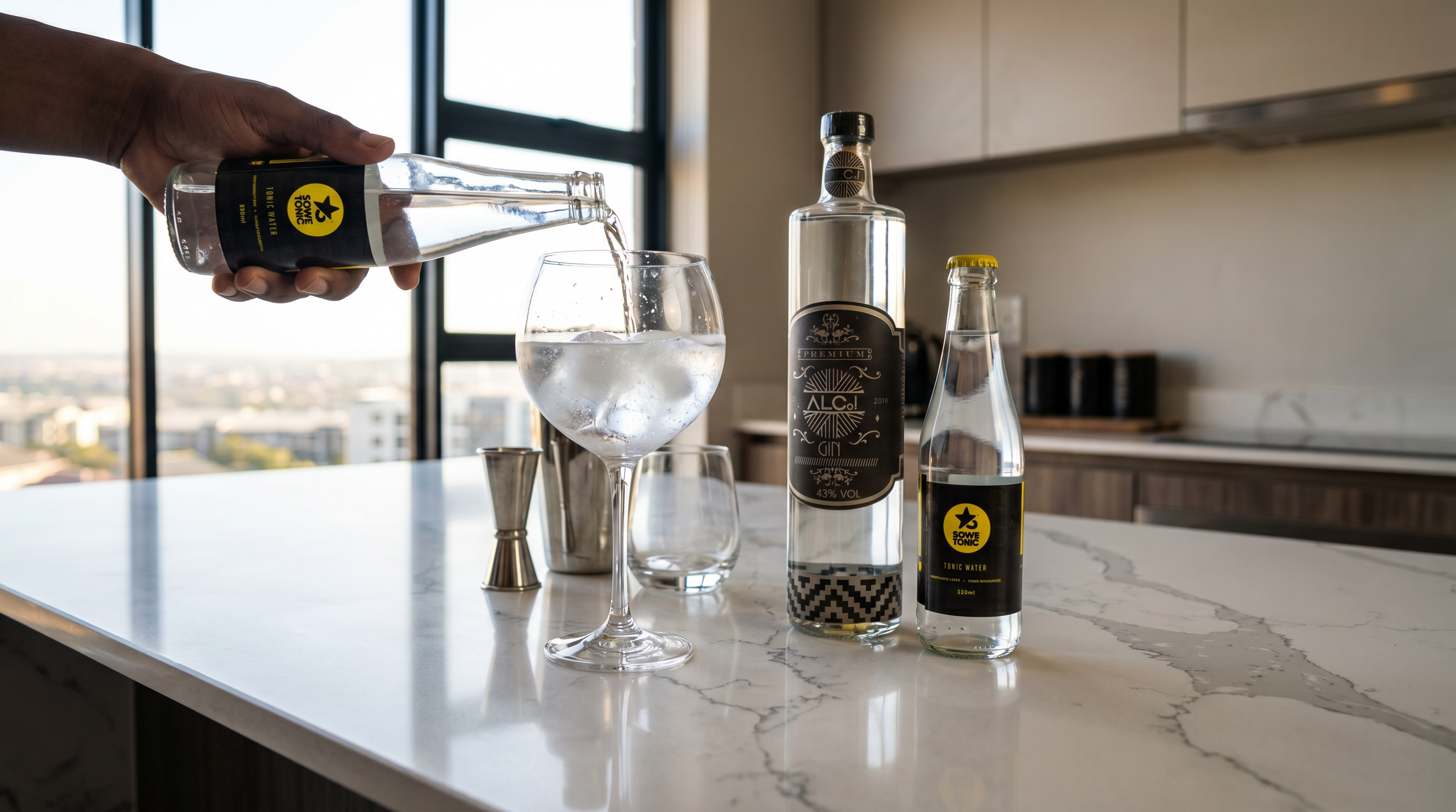 Brand Identity / Beverage
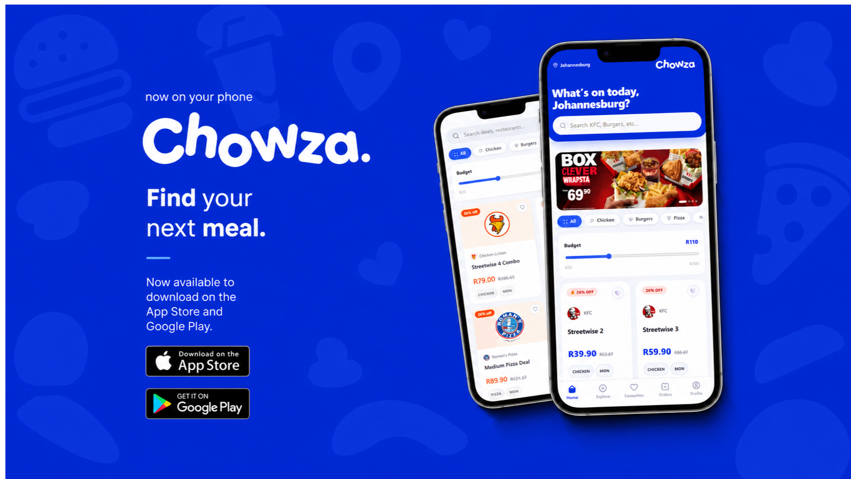 Product Design / App Brand
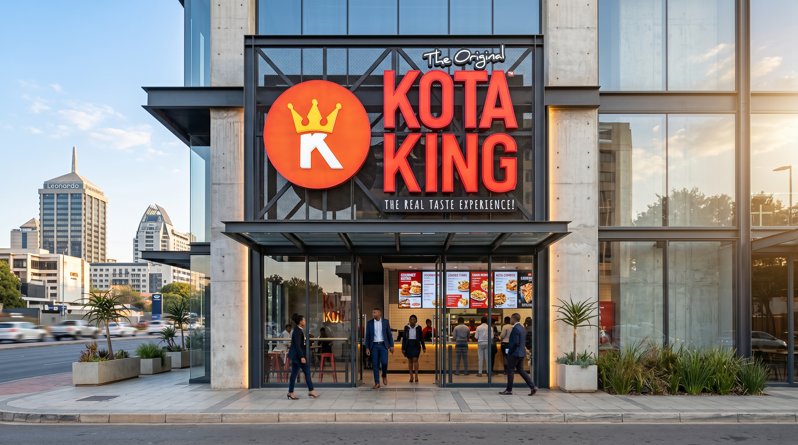 Brand Identity / QSR
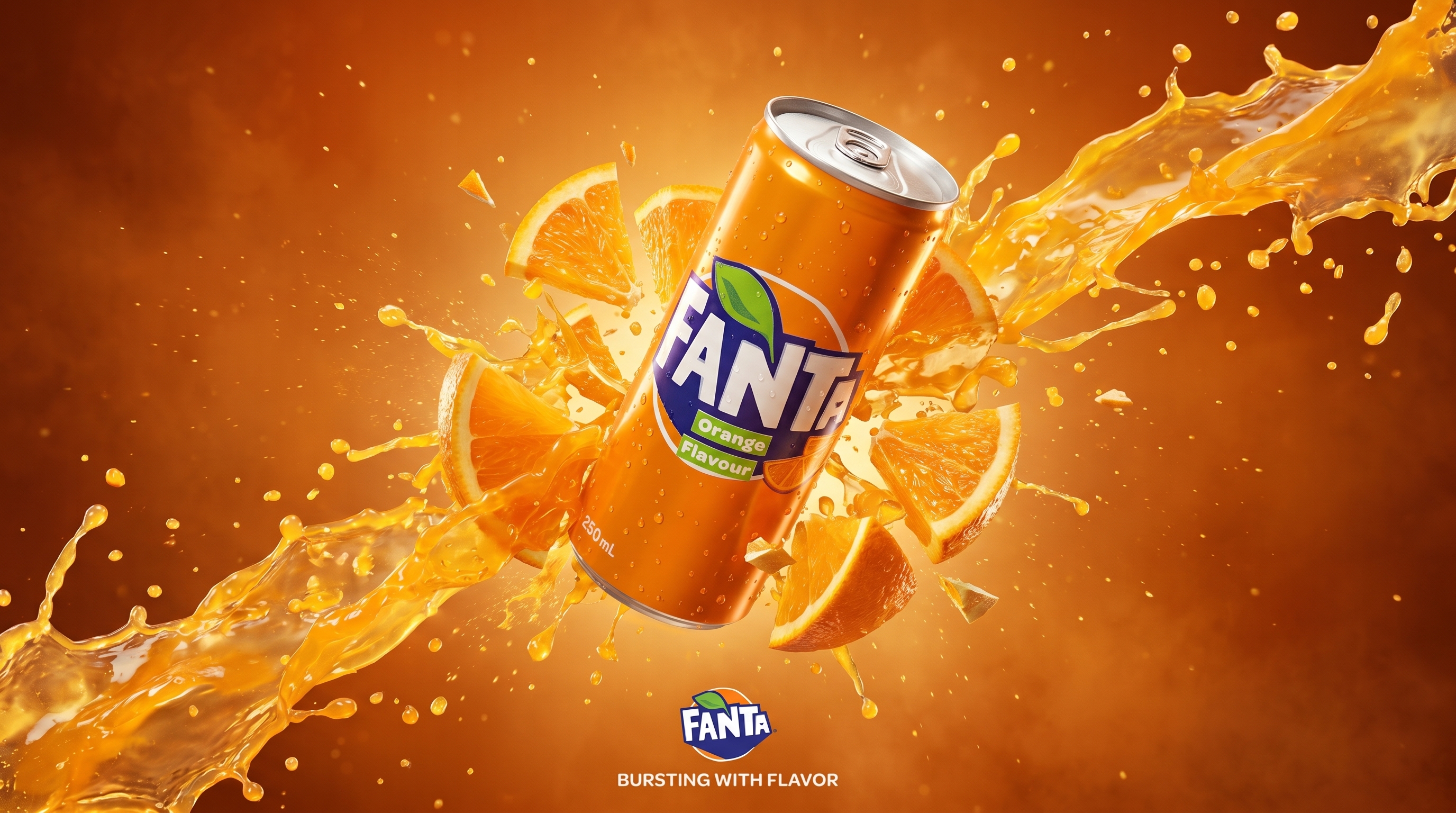 FMCG / Outdoor Campaign
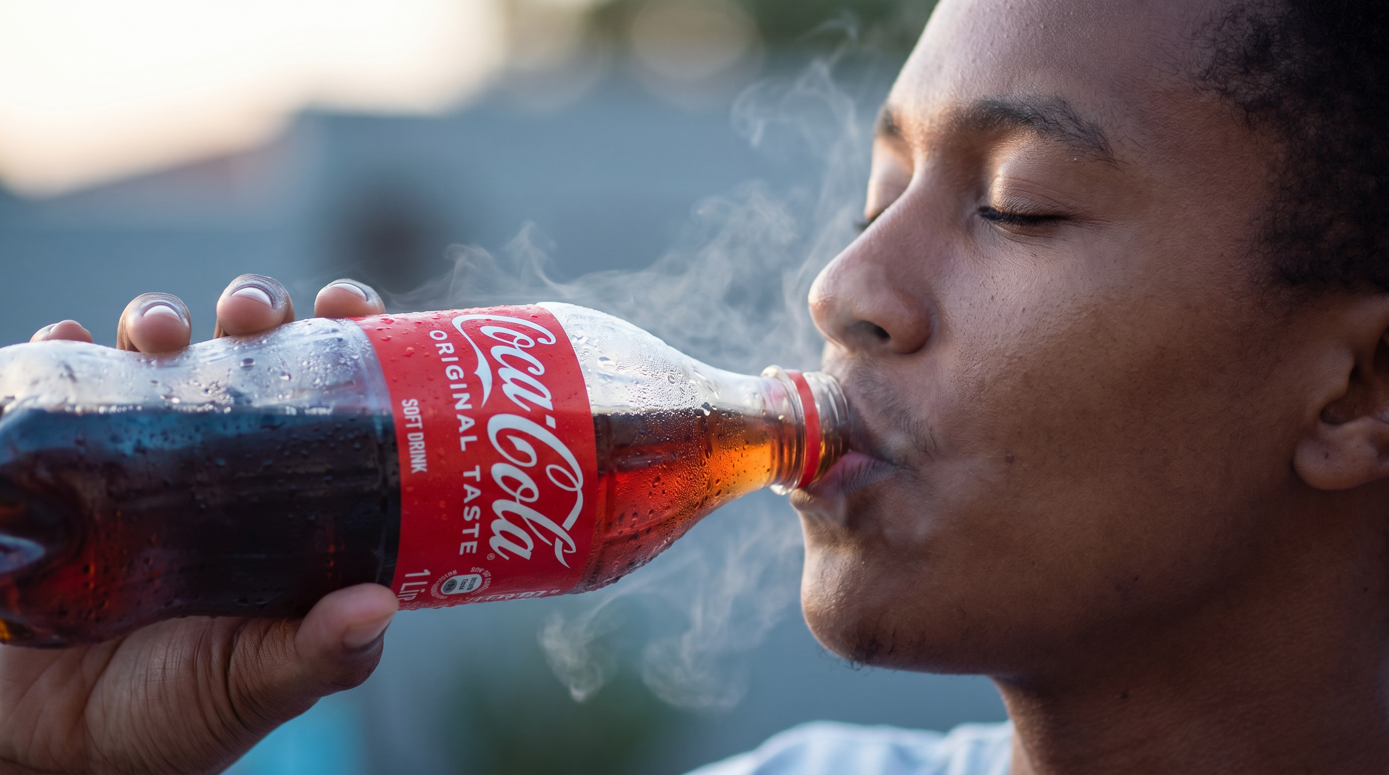 Global FMCG / CampaignProduct Brand / Consumer TechFMCG / CampaignGlobal Sports / CampaignRetail / Product MarketingEnterprise / Tech DistributionBrand Identity / Digital PlatformBrand Identity / BeverageProduct Design / App BrandBrand Identity / QSRFMCG / Outdoor CampaignGlobal FMCG / Campaign
Built for the way you work.
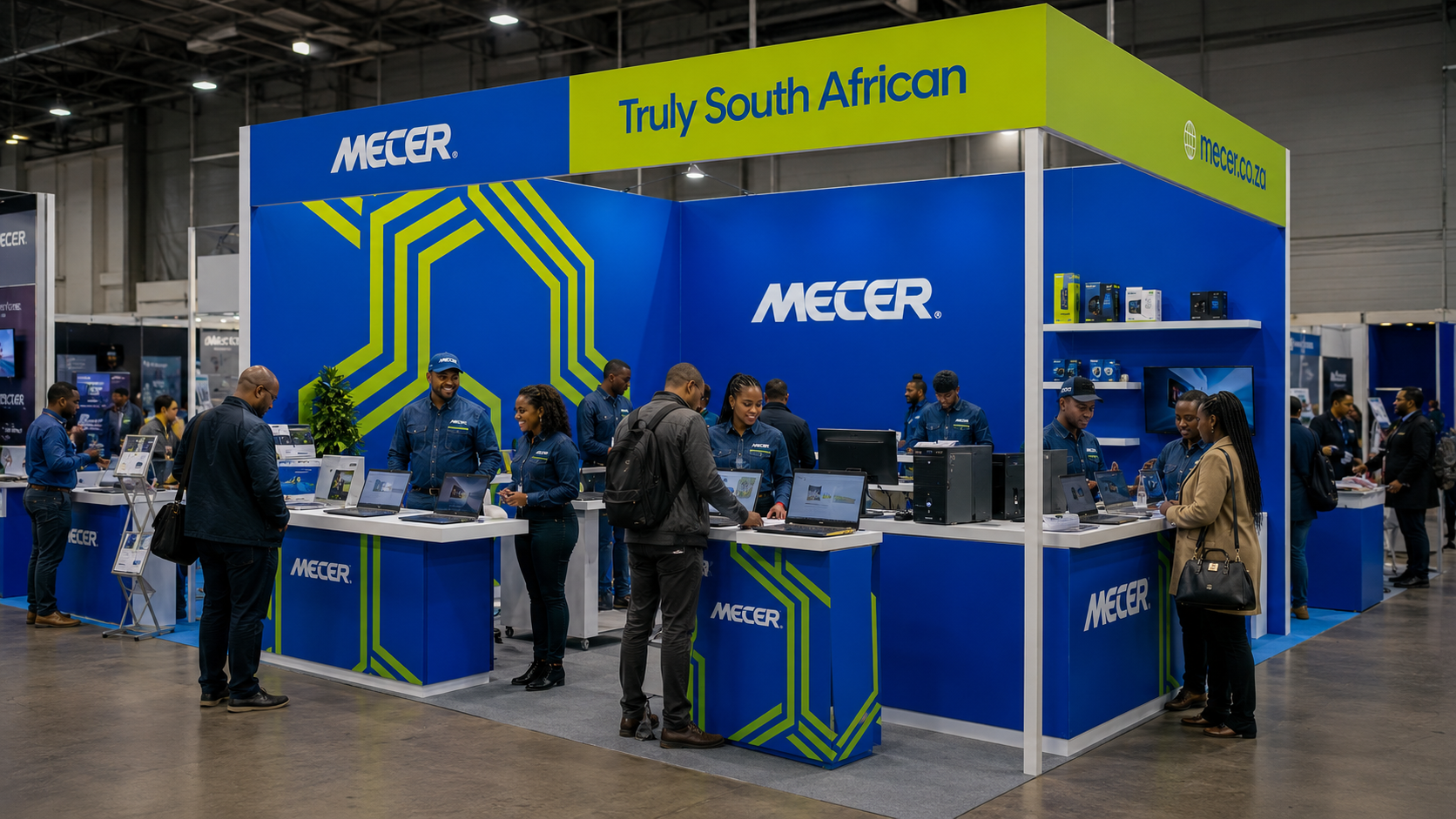
Brand and campaign design for Mustek's flagship consumer technology label.
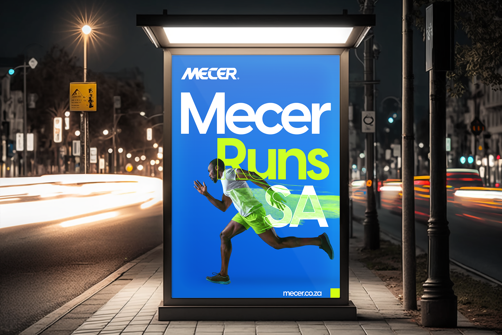
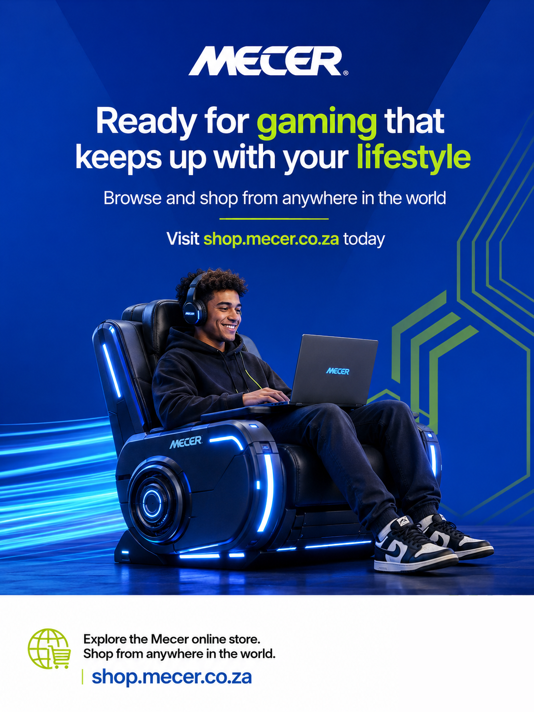
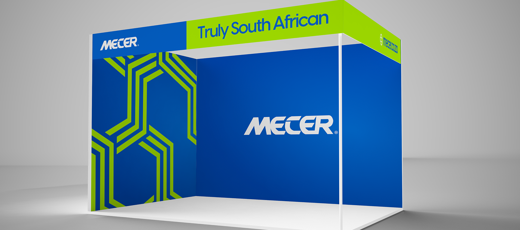
Mecer is Mustek's own consumer technology brand · laptops, peripherals, power solutions. I developed and maintained the product brand system: photography direction, campaign advertising, retail presence, and digital assets. The challenge was elevating a local brand to feel competitive next to global names at point of sale.
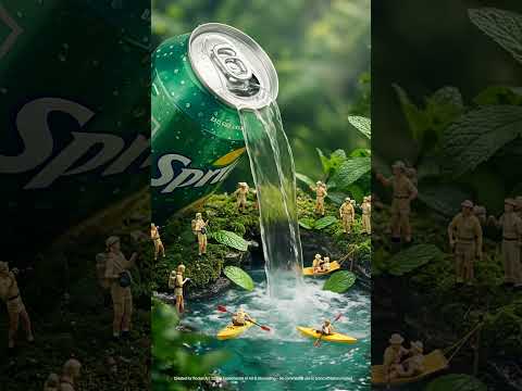
Obey your thirst.
Concept campaign materials for Sprite's South African market presence.
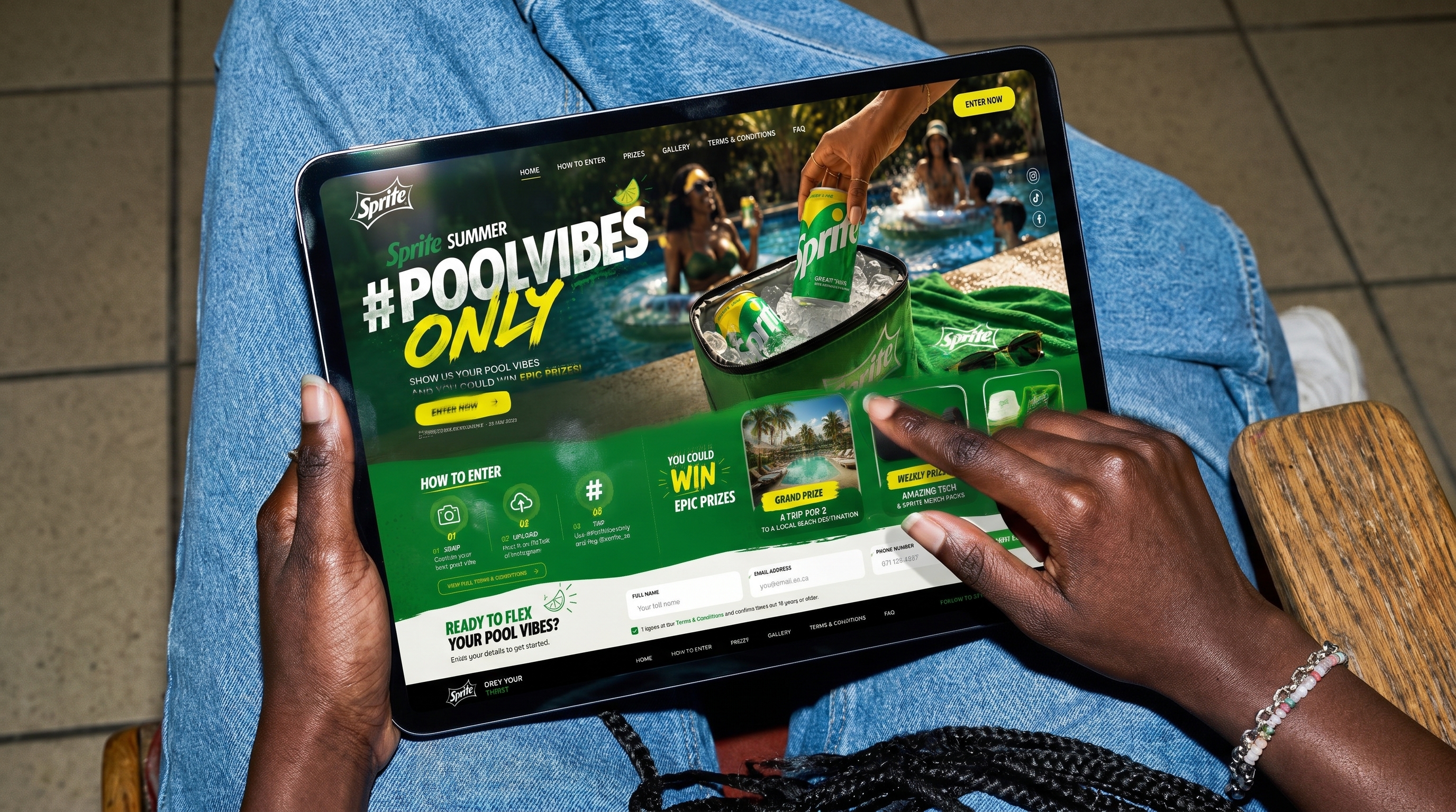
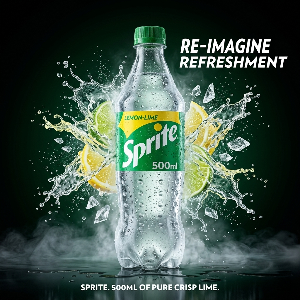
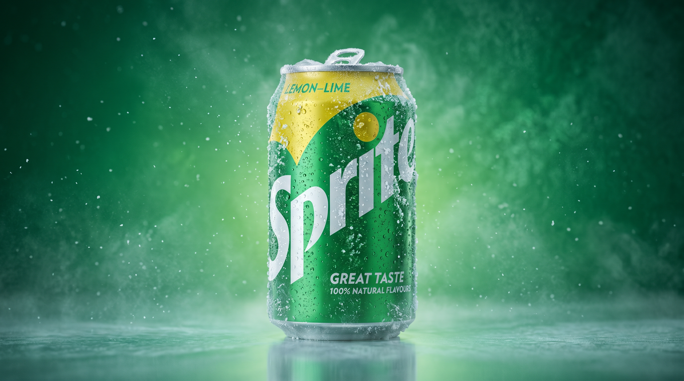
Sprite's brand language is built on refreshment as a cultural act · a state of mind shaped by refreshment, youth culture, and street-level energy. The campaign work explored how that message translates across outdoor, digital, and in-store environments in a South African cultural context. The visual direction stayed loyal to Sprite's bold green-and-white system while bringing a more energetic, street-level quality to the compositions.
Built for what comes next.
High-performance campaign direction for the Adizero performance range.
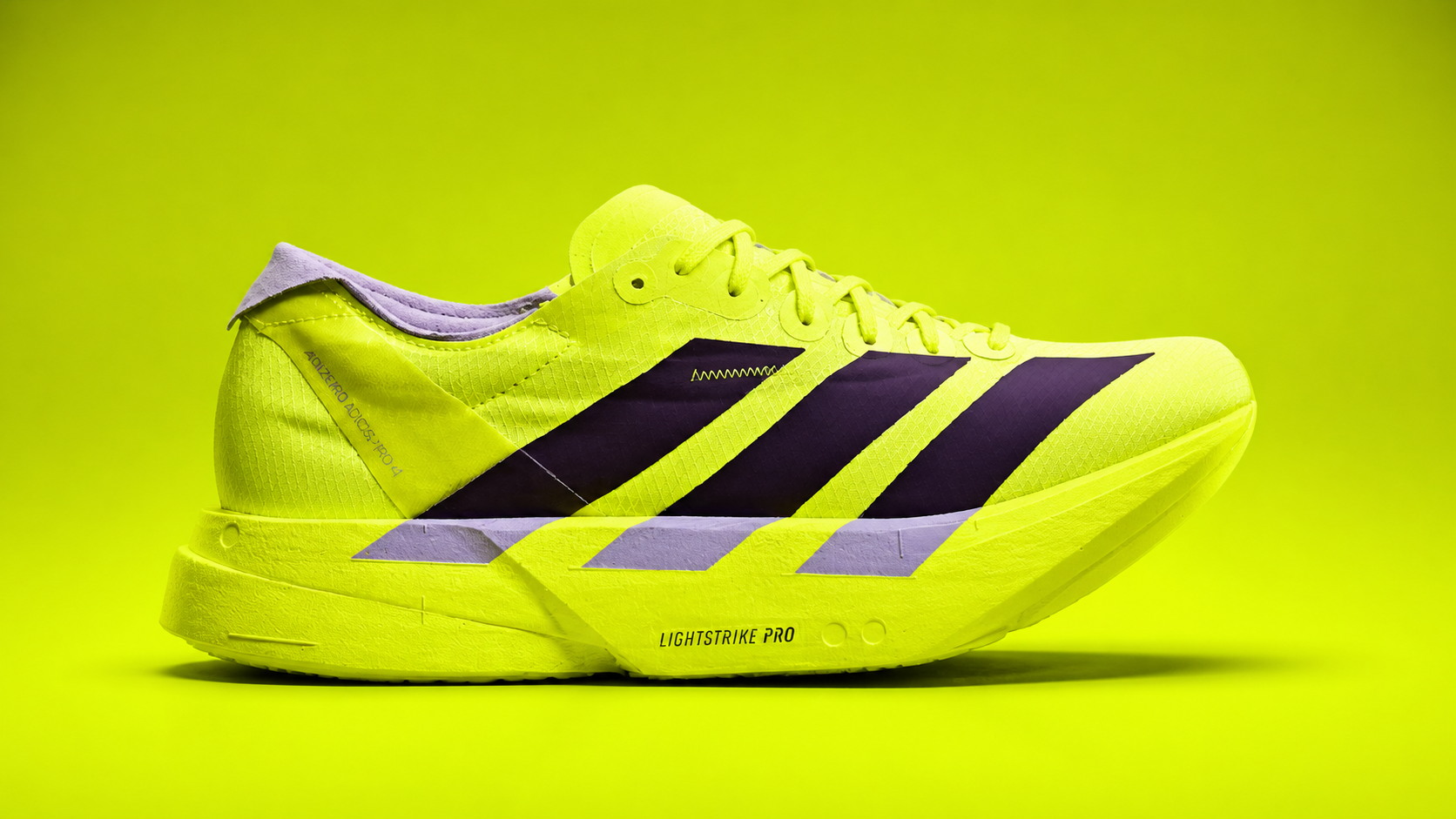
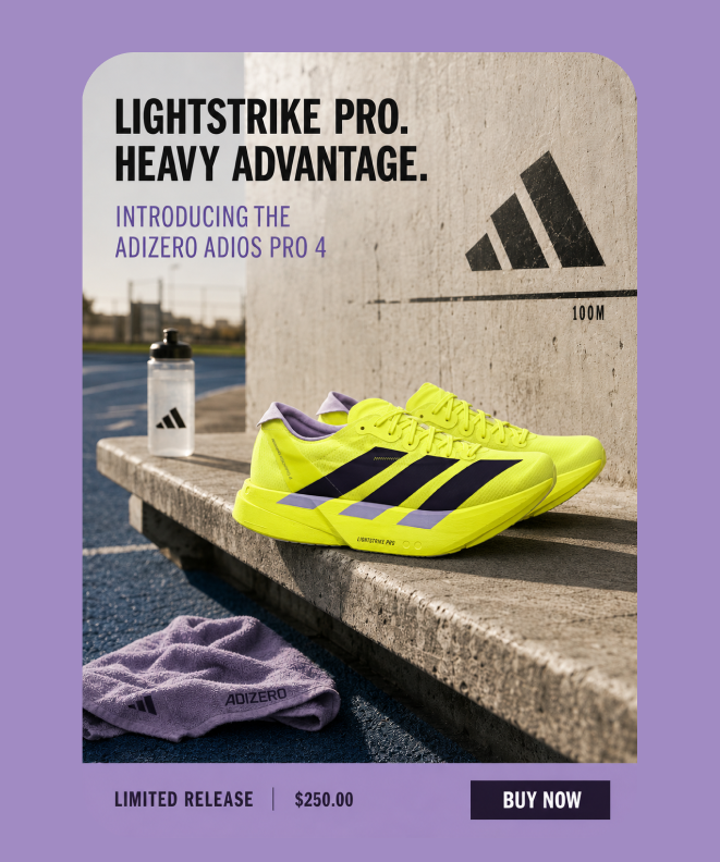
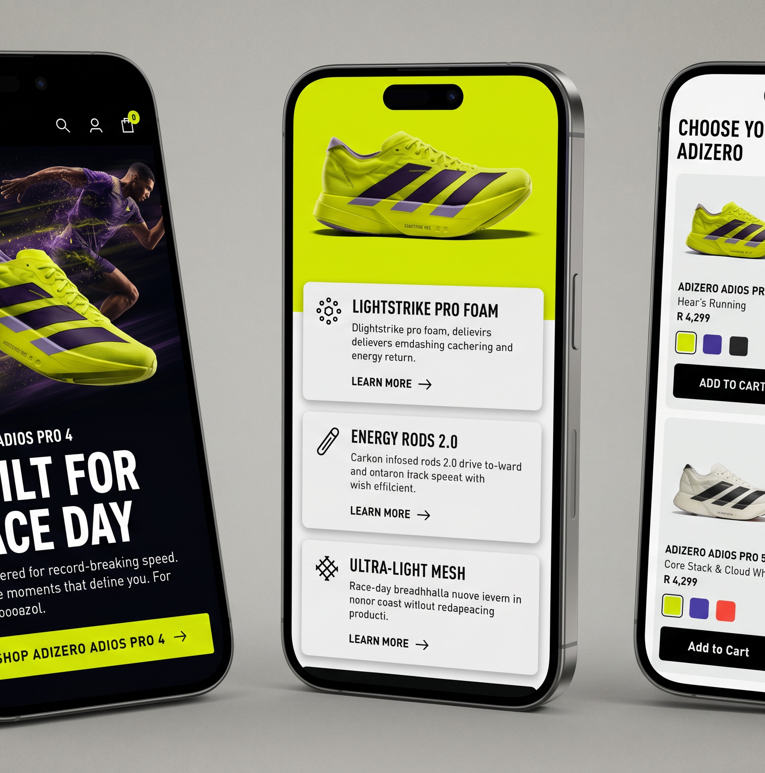
The Adizero campaign required communicating precision engineering to a performance audience. The creative direction drew from motorsport and aerospace visual languages · technical overlays, kinetic typography, and speed-referenced composition. Every frame was built to make the product feel like a machine engineered for human performance.
Ultrafast. Ultraportable.
Product marketing assets for Apple campaigns across iPad mini and iPhone retail communication.
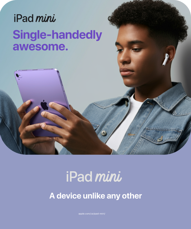
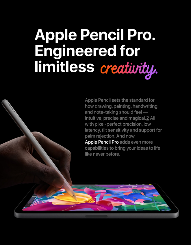
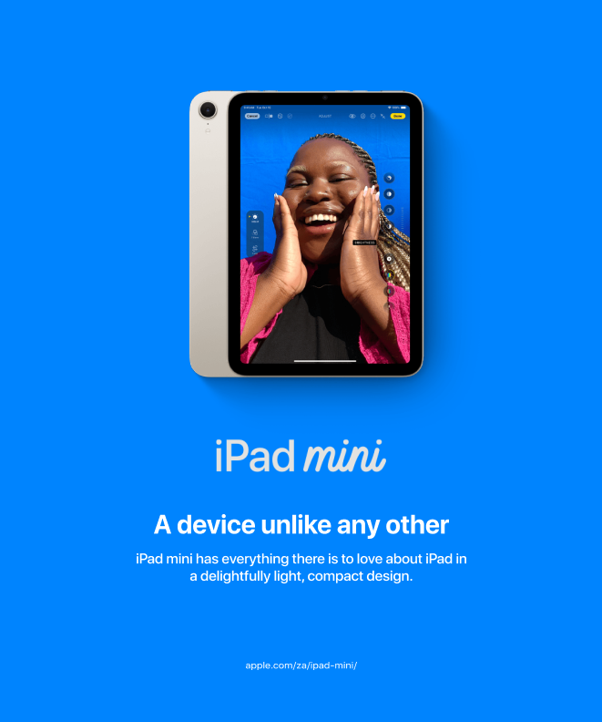
Apple campaign assets built around clean product storytelling, precise typography, and premium retail clarity. The work balances device-led hero imagery with compact copy systems designed for quick social and in-store recognition.
Technology. Distributed.
In-house creative lead across Mustek's entire brand communication ecosystem.
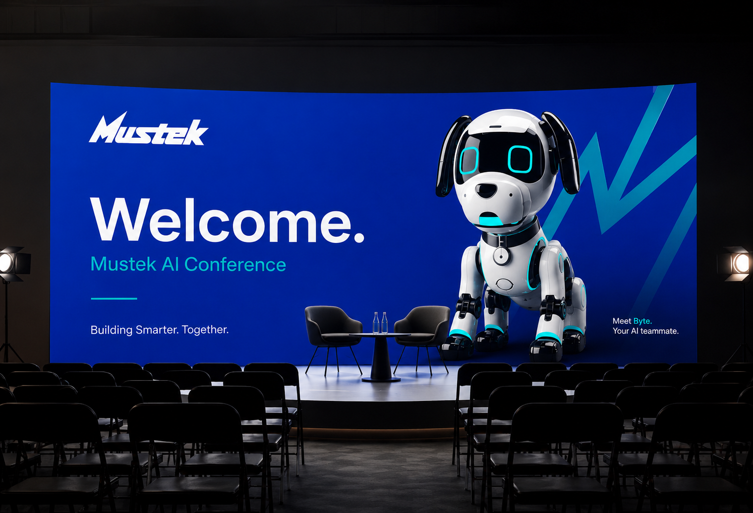
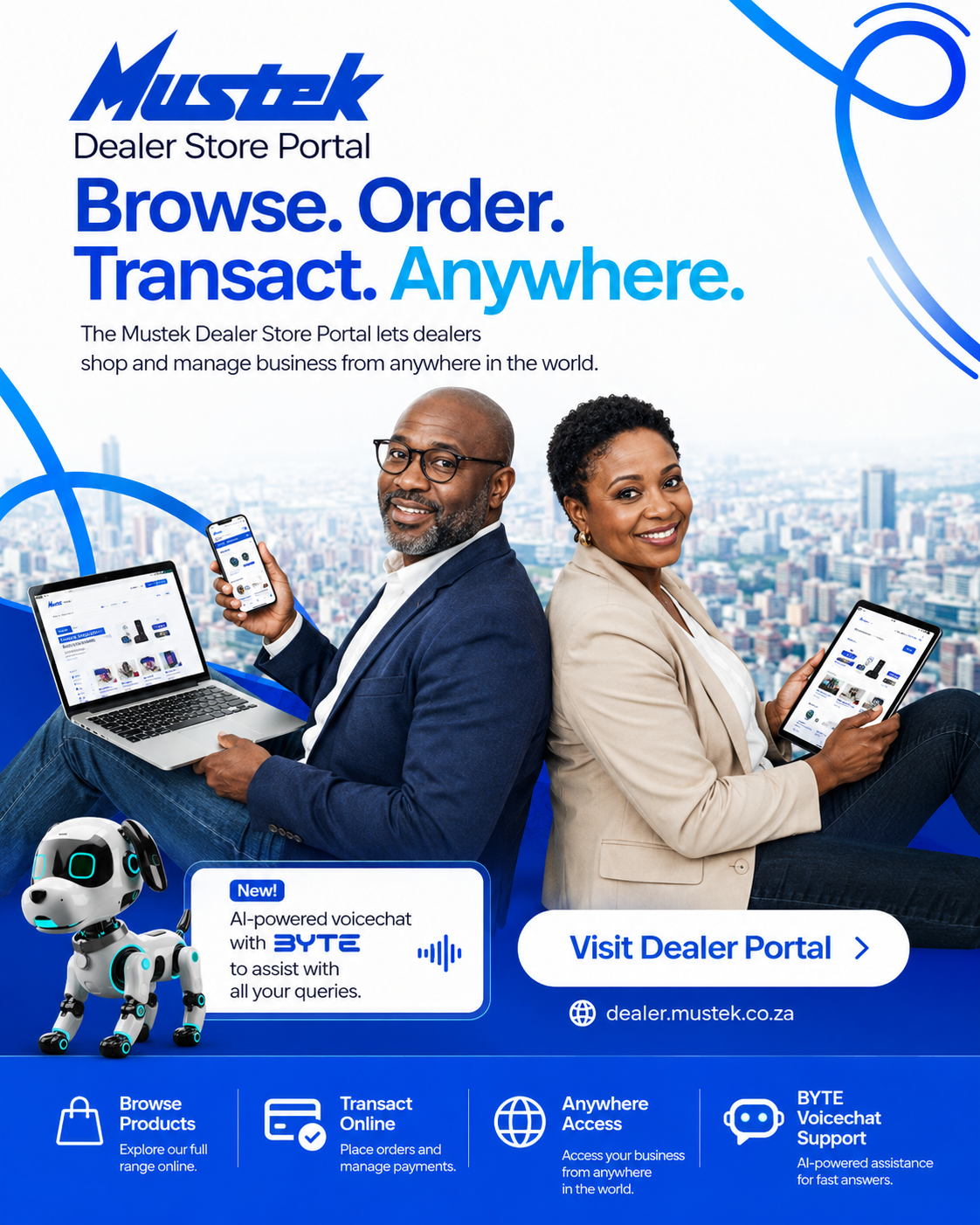
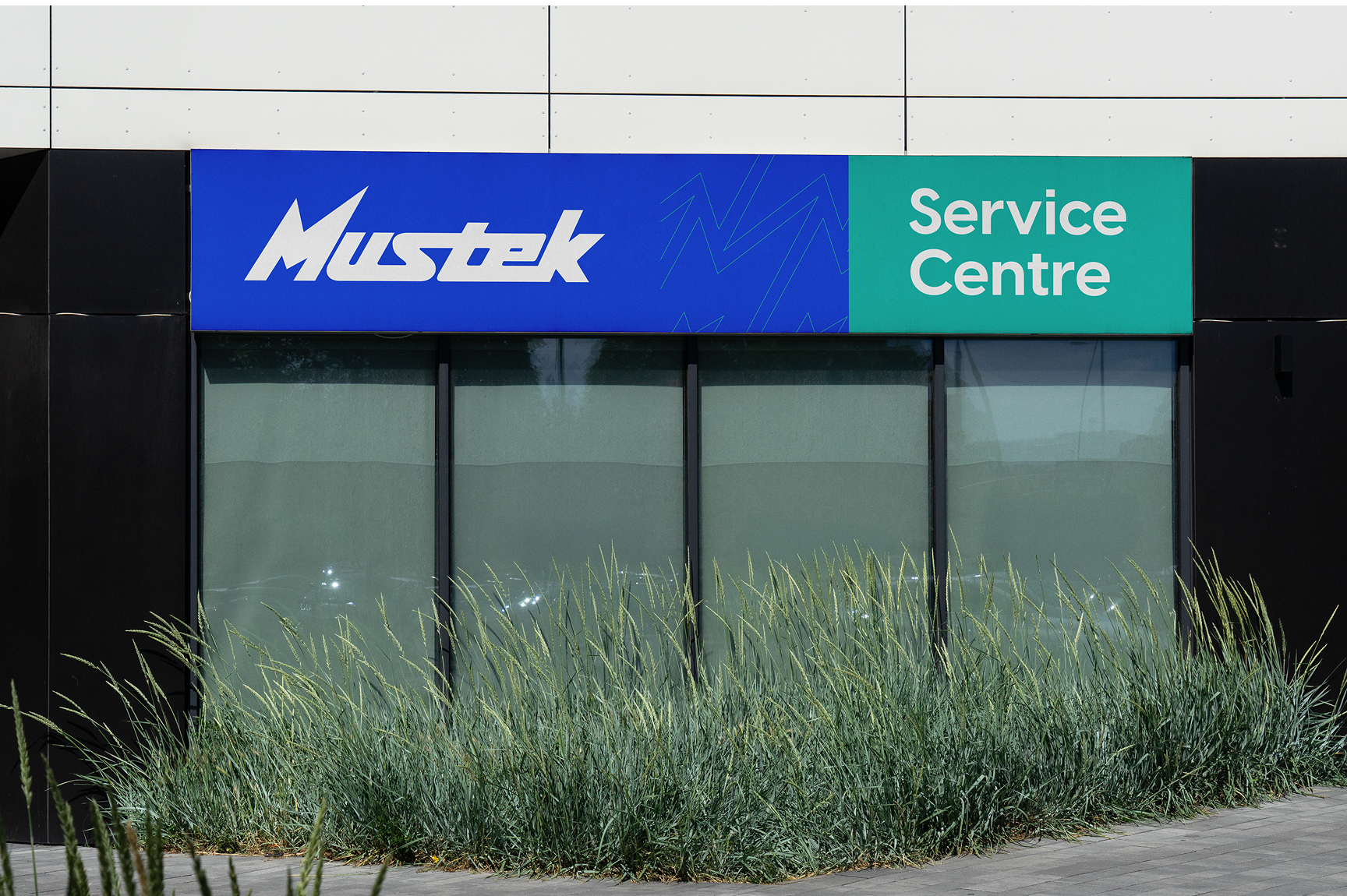
Mustek is southern Africa's largest technology distributor, representing over 60 global brands across the continent. As the in-house Senior Designer, I own the full visual communication system · from product launches and retail POS to webinar collateral, campaign materials, and partner co-branding. Every global brand touchpoint that moves through Mustek carries design work I produced.
Cloud. Simple. Yours.
Full brand identity designed from inception for a Mustek digital solutions platform.
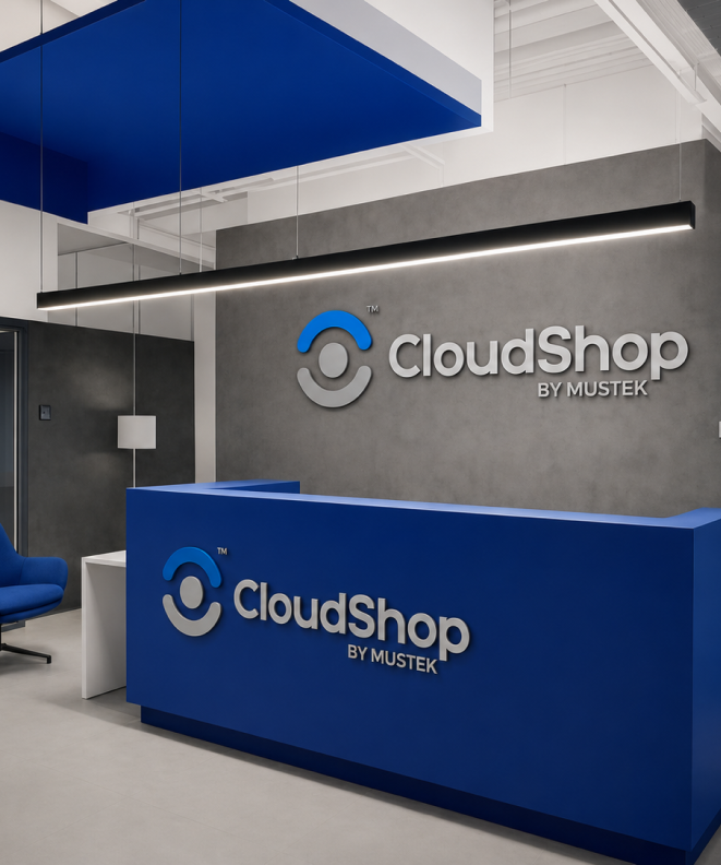
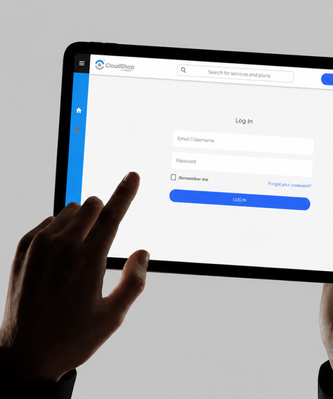
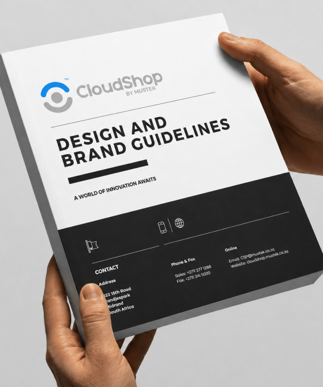
CloudShop by Mustek is a digital solutions platform built to give businesses easier access to cloud services, software subscriptions, and technology resources. I designed the brand from the ground up — logo, visual language, and full corporate identity guidelines — establishing a clean, modern system built to scale with the product. The brief was to make enterprise cloud feel approachable without losing credibility.
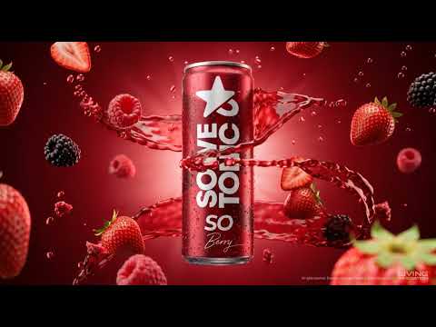
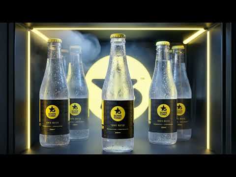
Township roots. Premium pour.
Brand identity system for a new generation township premium mixer brand.
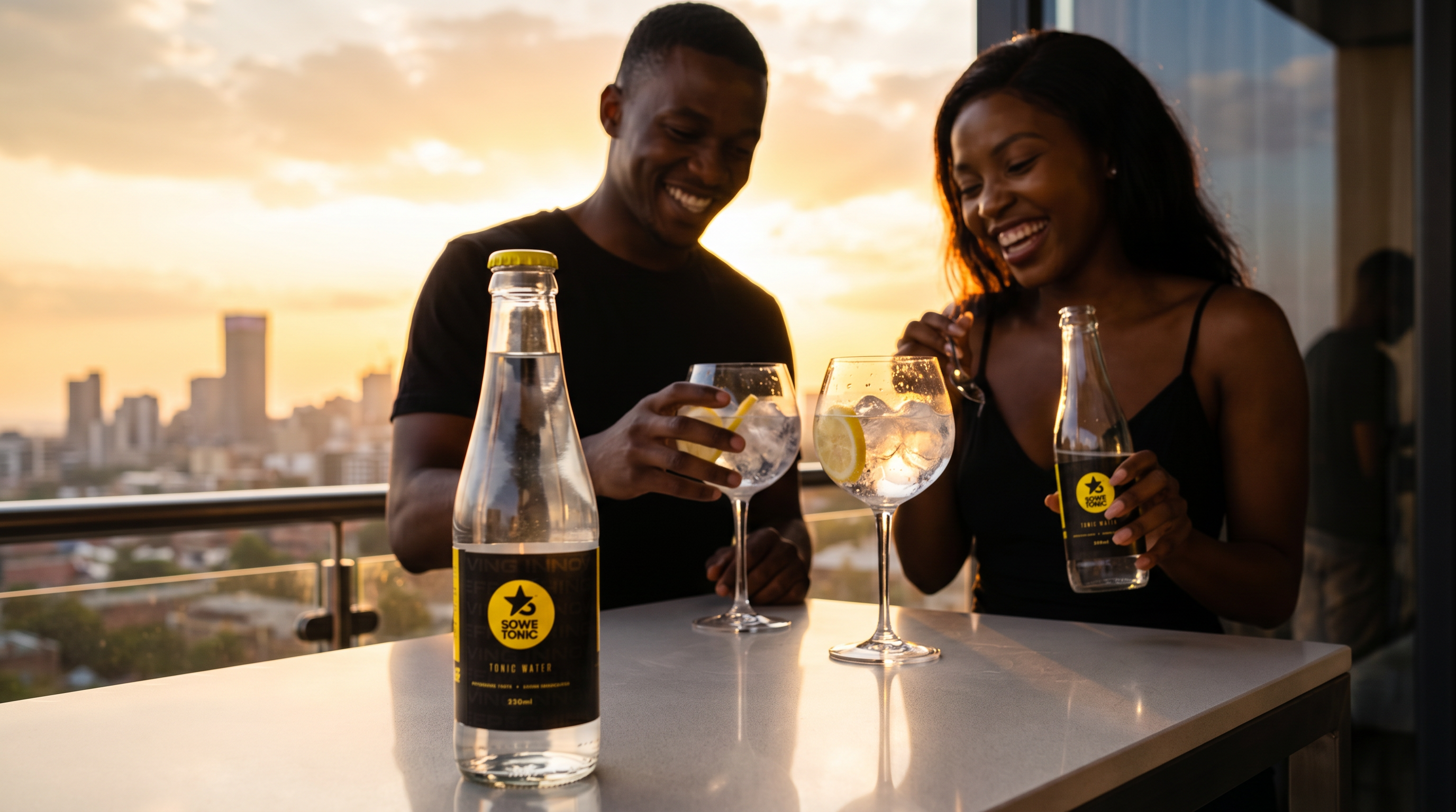
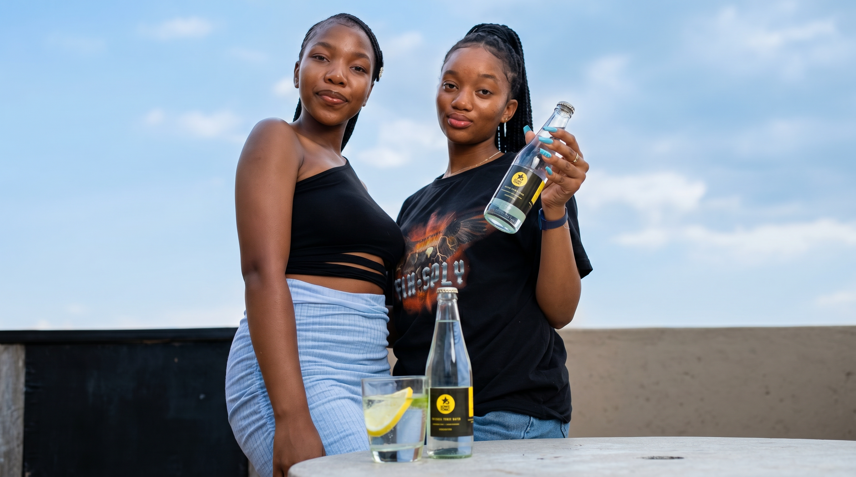
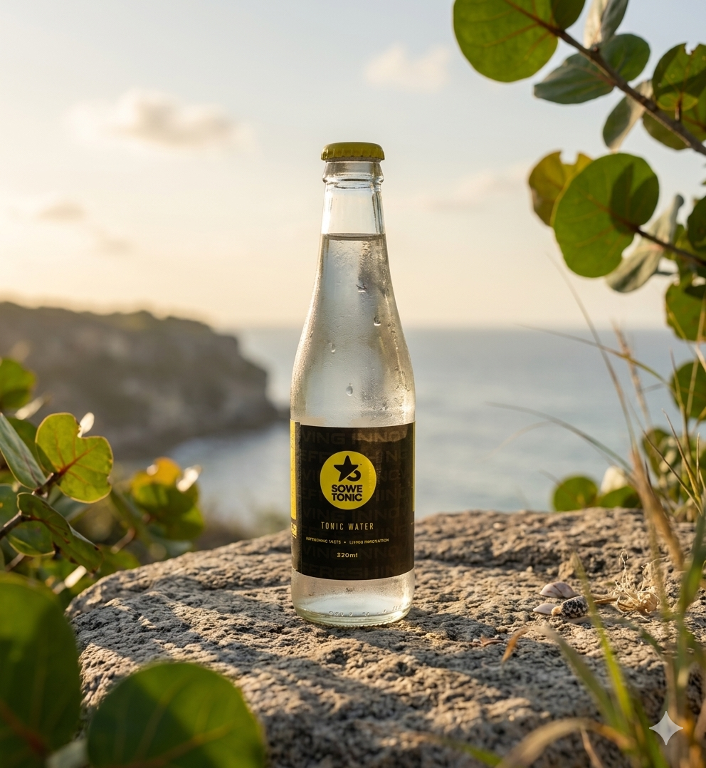
Sowetonic was imagined as more than a tonic water brand. It represents a new generation of township entrepreneurship · young, ambitious, design-aware, and globally inspired while remaining deeply connected to its Soweto roots. The creative direction positioned the product as a sophisticated lifestyle beverage designed for modern urban culture, rooftop social spaces, and premium hospitality environments. The visual world balances minimalism with cultural confidence · allowing the product itself to carry elegance through restraint, realism, and refined composition.
Find your next meal.
End-to-end brand identity and product design for a South African food discovery app.
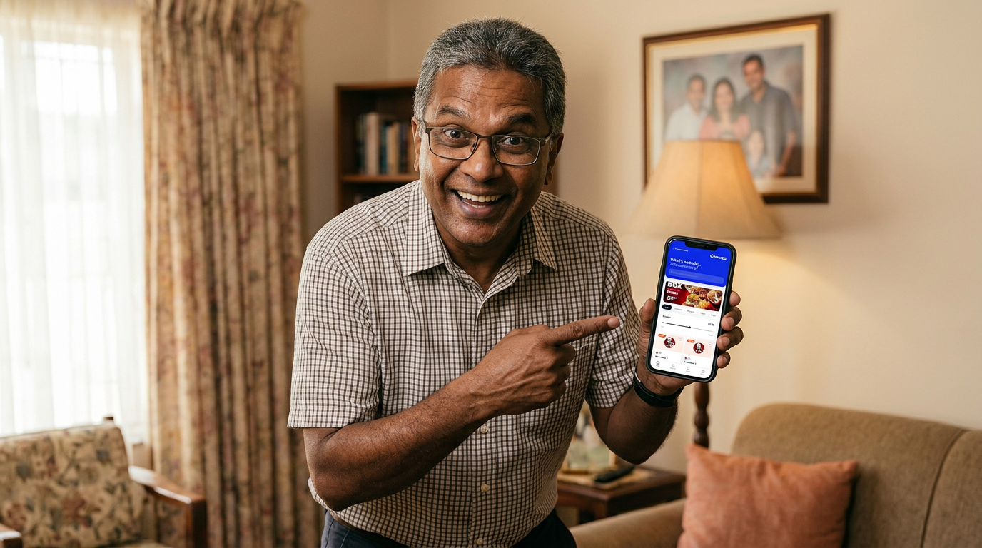
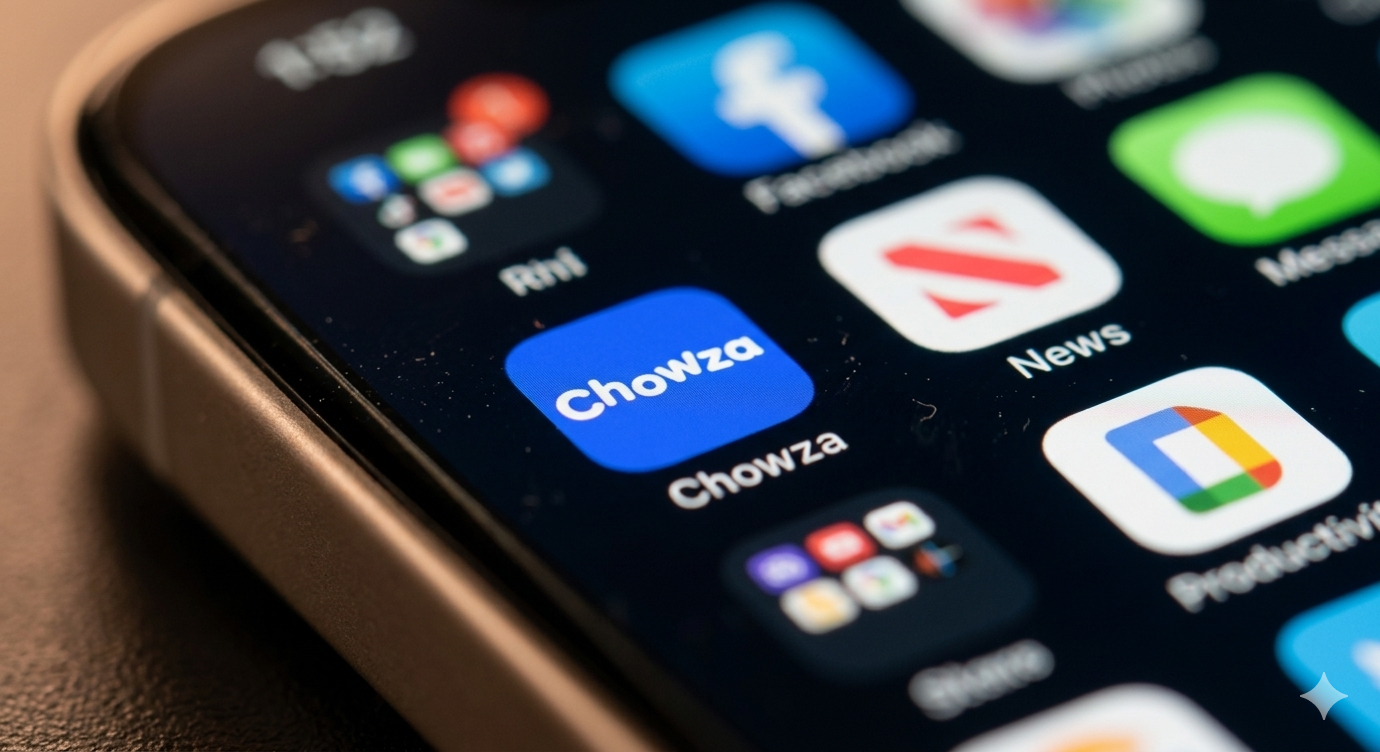
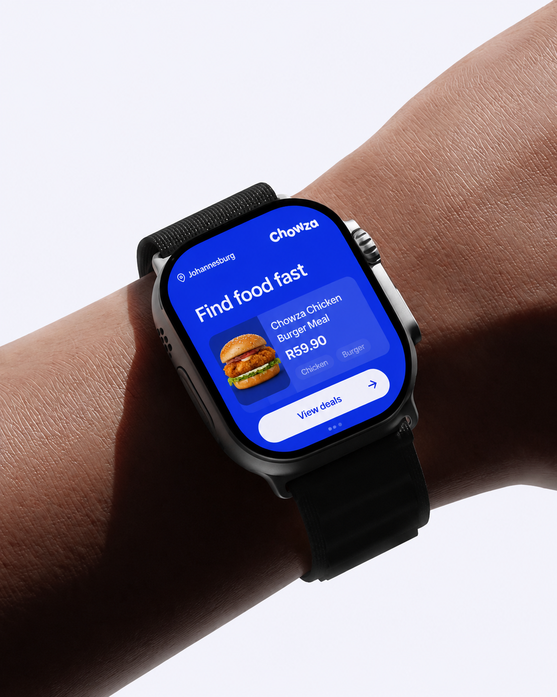
Chowza is my own product · a food discovery and deals platform built for how South Africa eats. From Streetwise to flame-grilled, from R29.90 to feeding the whole crew, Chowza aggregates every deal in one place. I designed the full brand identity, UI system, marketing materials, and app screens · building a product that needed to feel premium enough to compete with established players while remaining warm and accessible to a broad South African audience.
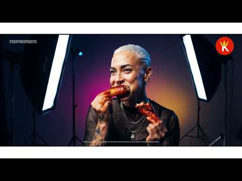
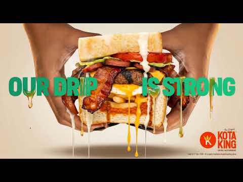
Kings of the corner.
Brand identity and campaign for a proudly South African township fast food concept.
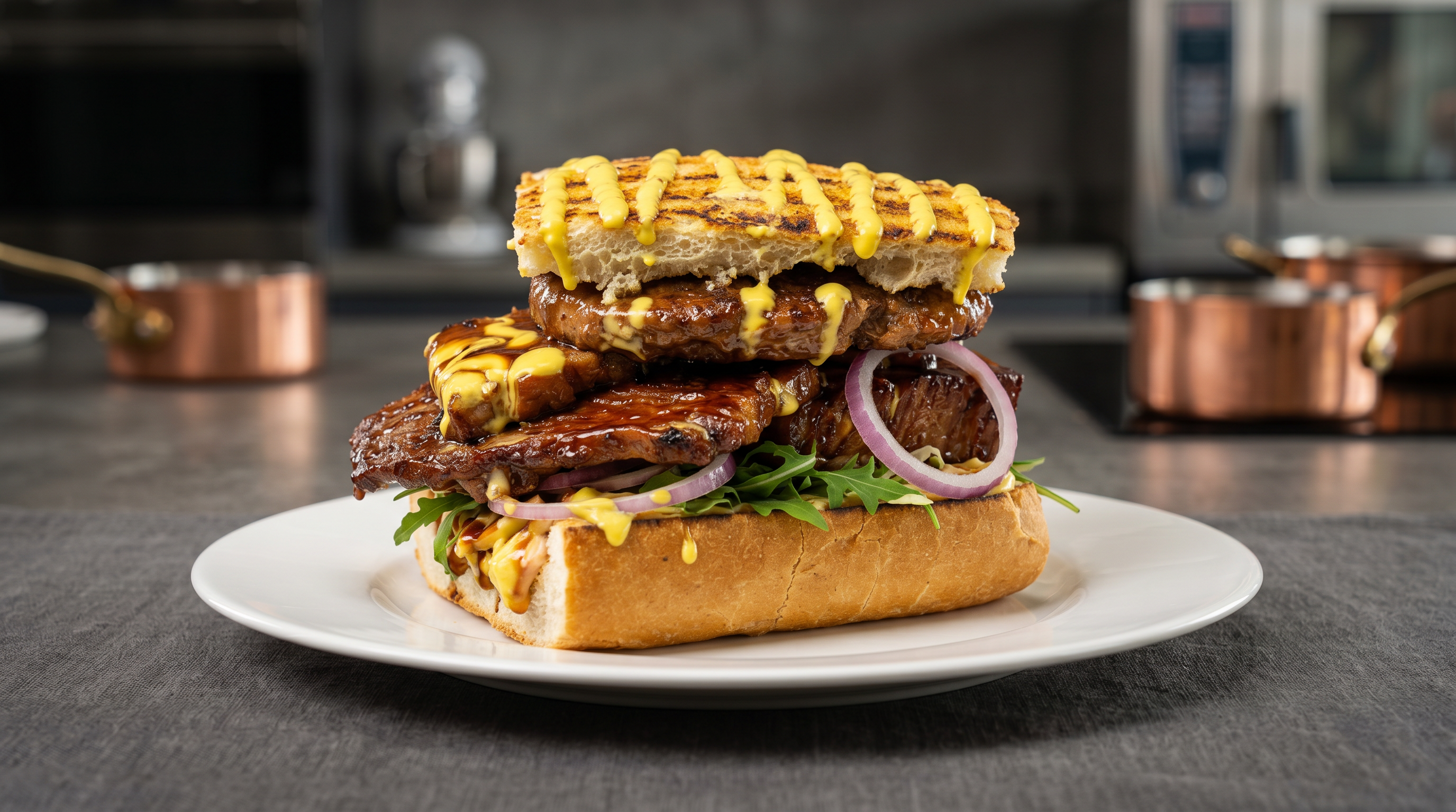
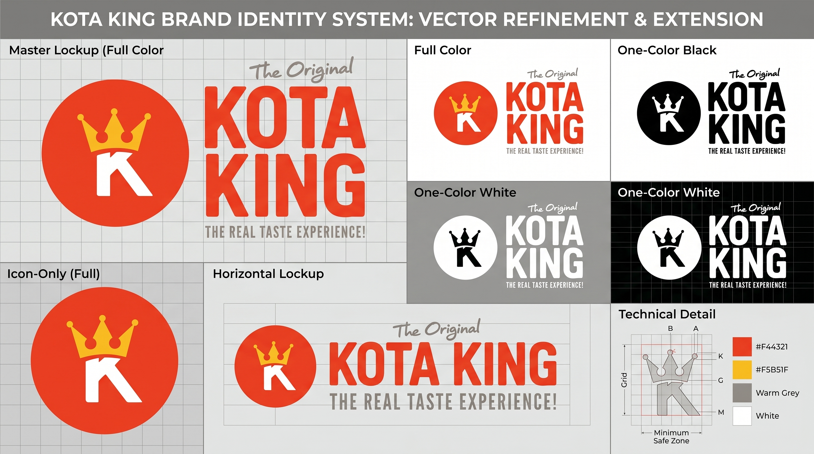
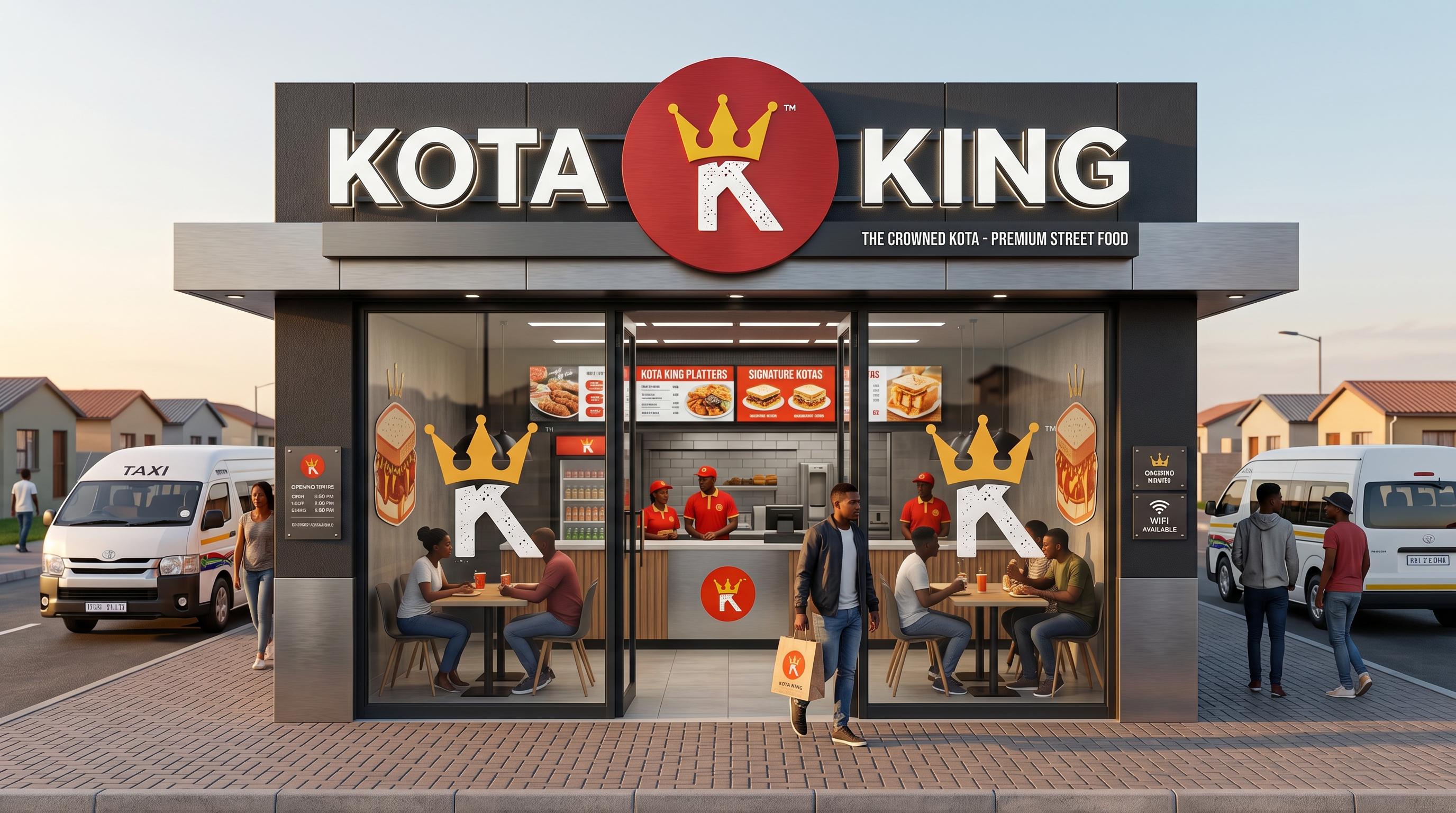
Kota King is a South African QSR brand built around the kota · the iconic township street food. The brand needed to honour its cultural roots while feeling modern, scalable, and commercially viable. The identity system drew from township visual culture: bold colour, confident typography, and an energy that felt authentic rather than commodified.
Orange You Thirsty?
Large-scale outdoor activation campaign built around bold typography and cultural energy.
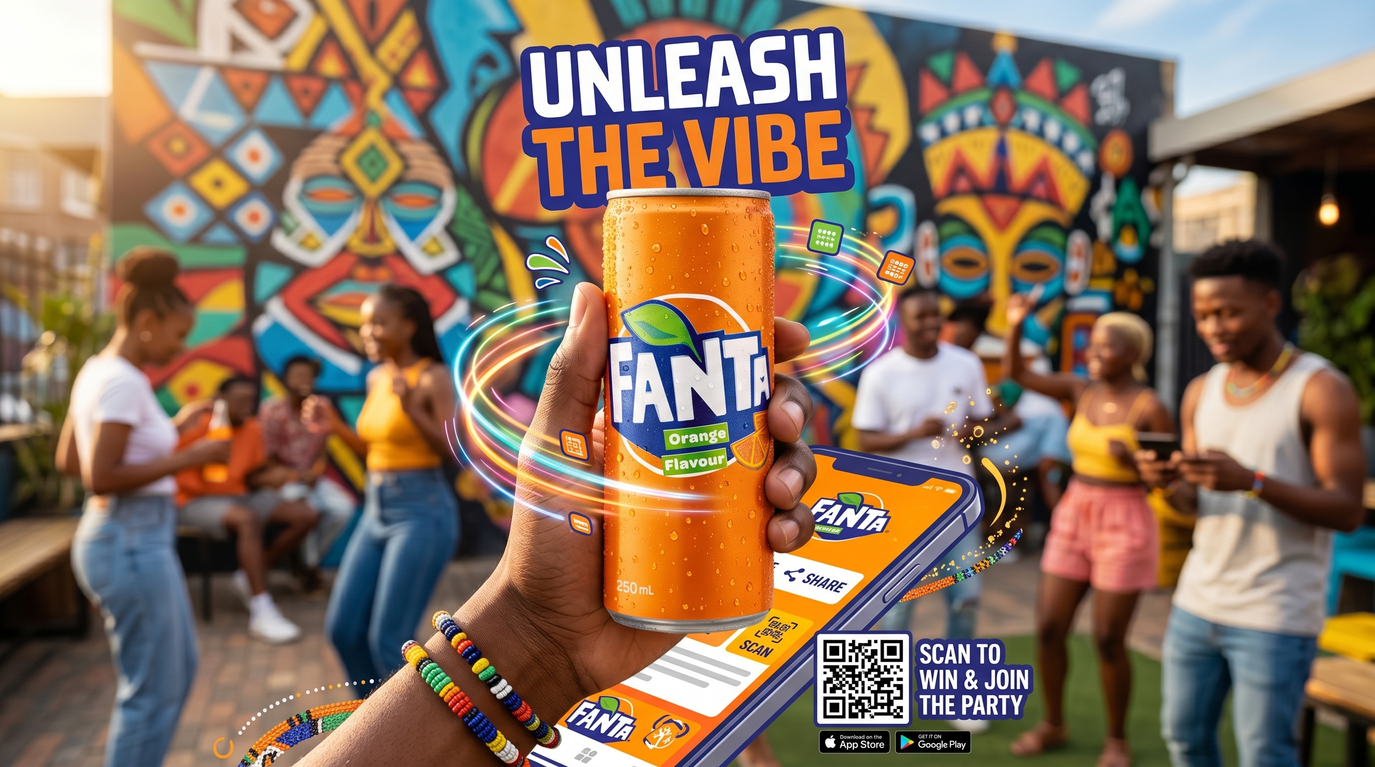
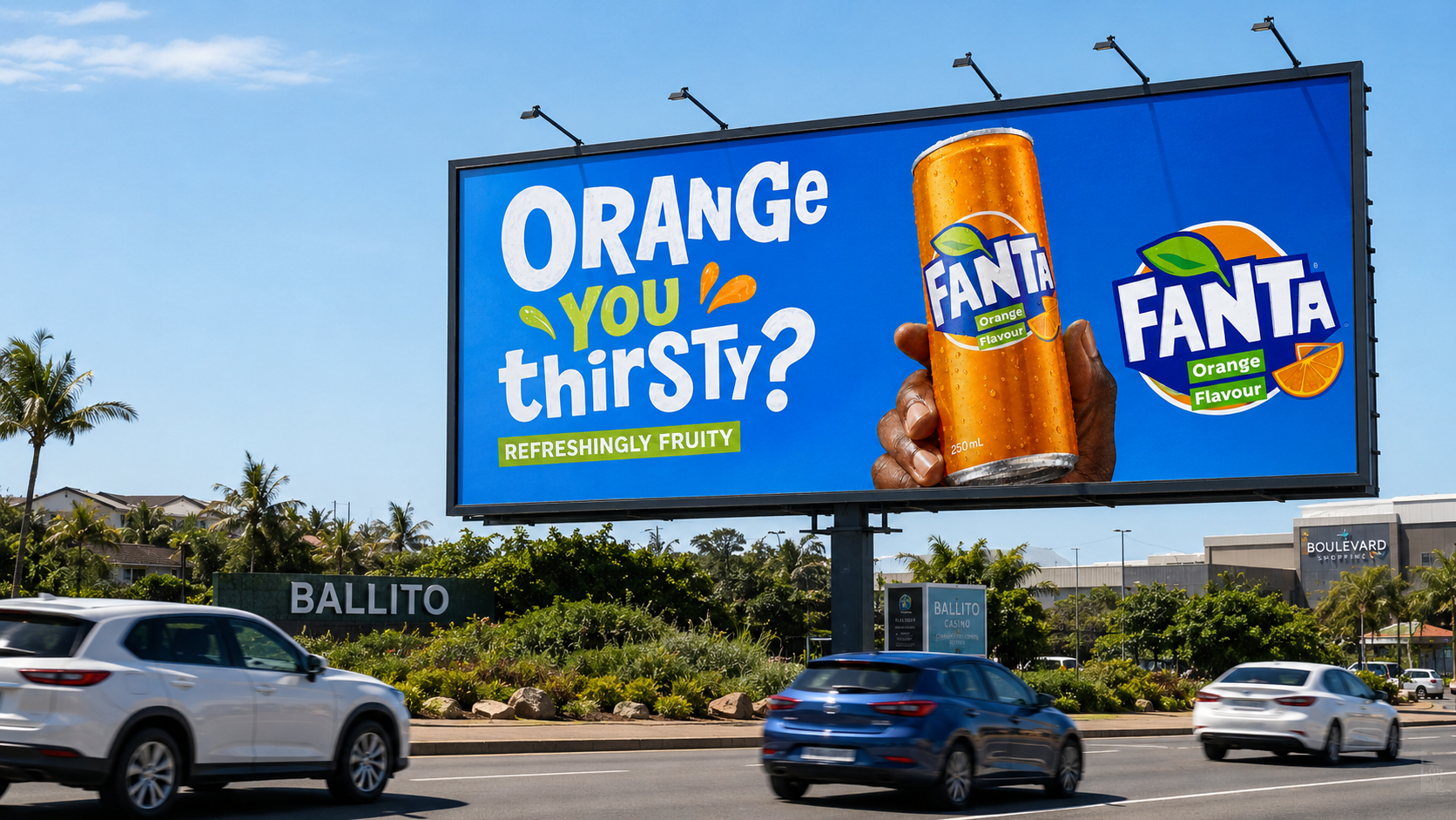
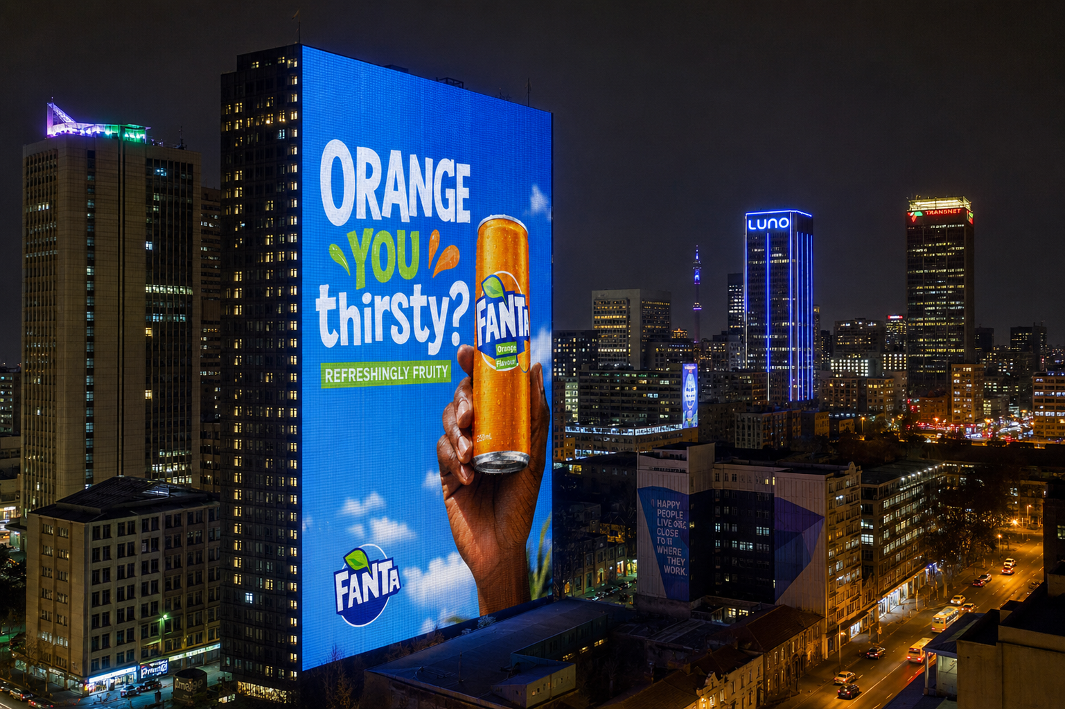
This concept project explored what a fully realised Fanta outdoor campaign could look like across South Africa · from Ballito billboards to skyscraper facades, festival stages, and digital city infrastructure. The campaign was built around the playful slogan "ORANGE YOU thirsty?" · transforming a simple line into a bold visual identity system capable of living anywhere the brand needed to show up. The objective was to create a campaign that feels youthful, energetic, culturally alive, and impossible to ignore.
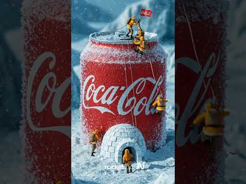
Serve Cold.
Concept campaign centred on cold temperature as an emotional brand experience.
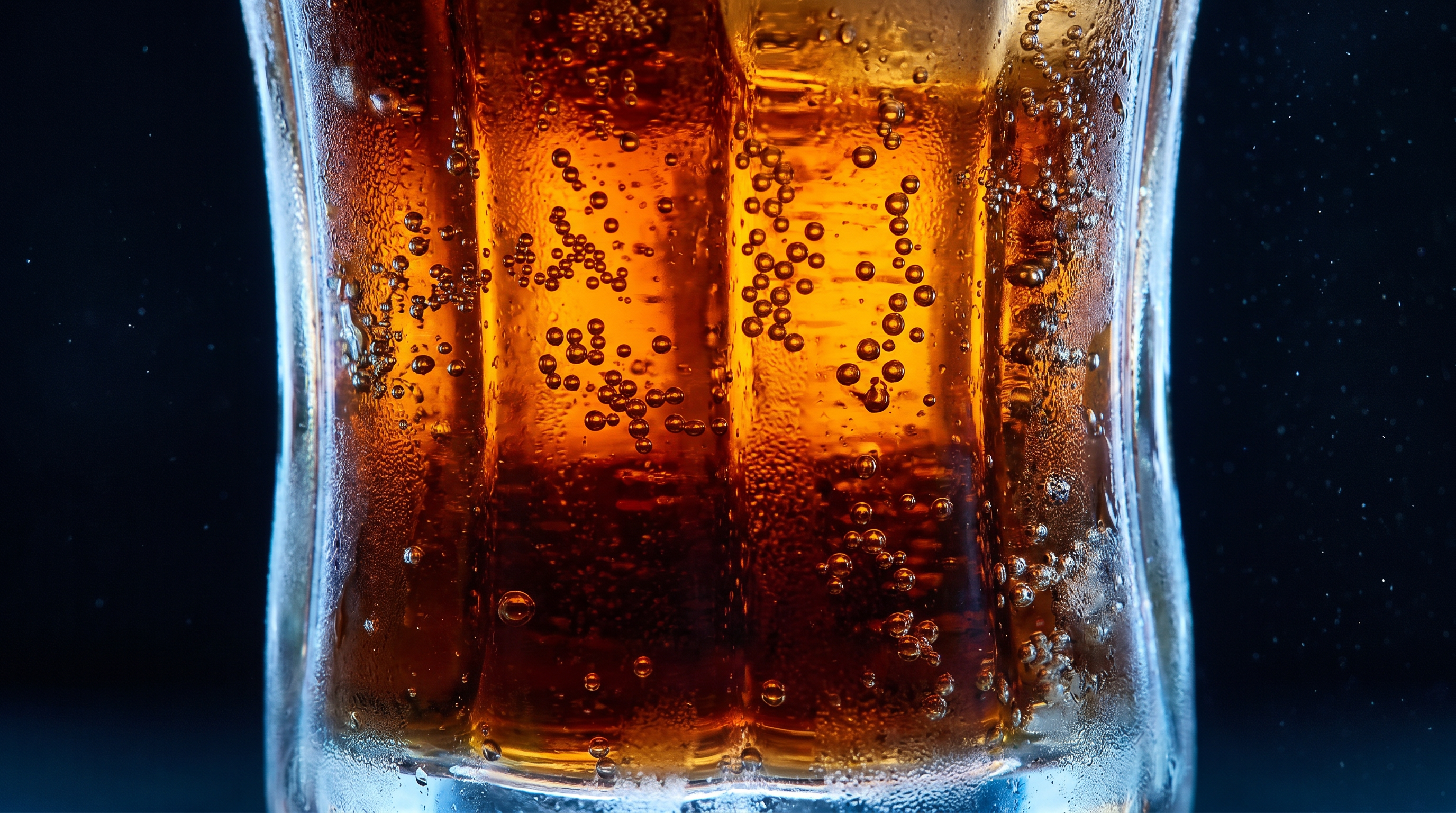
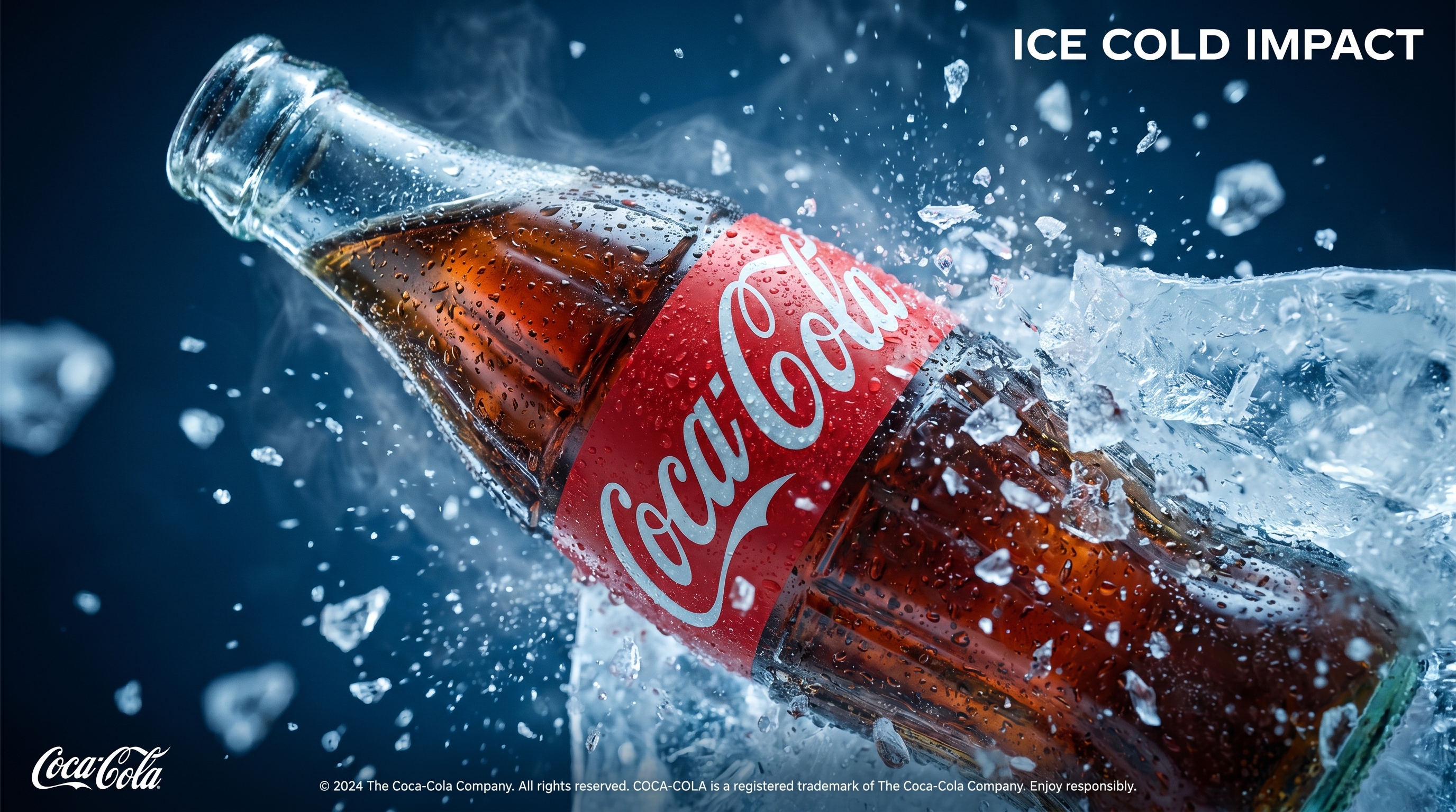

This concept project explored Coca-Cola's relationship with cold · as a sensory brand promise with temperature, ritual, and recognition built into every frame. The direction leaned into high-contrast product photography, dramatic lighting, and minimal copy to let the product carry the story. The result was a premium visual system that felt worthy of the world's most recognised beverage brand.